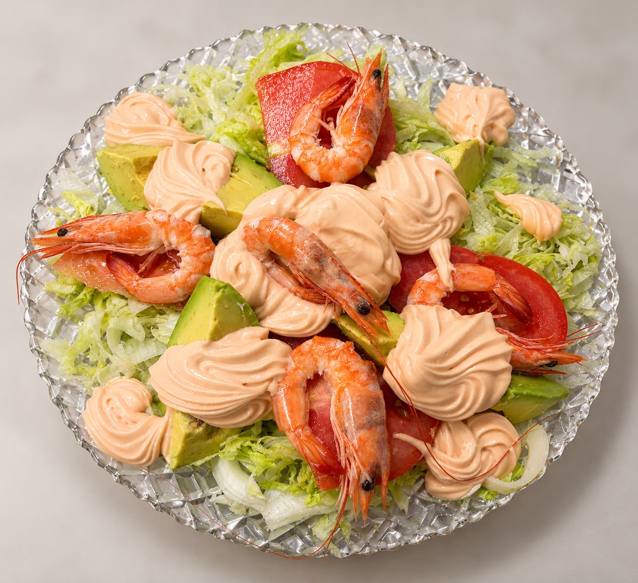
 ensaladas
Ensalada San Marco
18.50 €
Desde 1994 · Familia Ramacciotti
Restaurante italiano a dos pasos de la Plaza de España. Treinta años elaborando pasta fresca cada mañana, masas fermentadas 48 horas y los platos que Aldo trajo desde Italia. Bienvenidos a casa.
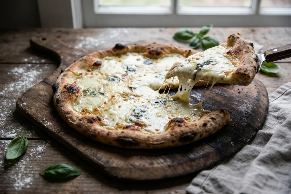
Masa fermentada
Pizzas ligeras, digestivas, horneadas a leña
Pasta fresca diaria
Elaborada cada mañana en nuestra cocina
Productos italianos
Importados directos: harinas, quesos, jamones
Familia Ramacciotti
Tres décadas cuidando cada plato
Nuestra cocina
Cada plato sigue la receta original que la abuela Encarnación pasó a Aldo Ramacciotti. La carbonara con guanciale y pecorino, los raviolis de ricotta rellenos a mano cada mañana, el ragú cocinado a fuego lento durante seis horas.
Importamos harina 00 desde Caputo, mozzarella di bufala DOP, prosciutto di Parma 24 meses y aceite de oliva virgen extra toscano. Sin atajos. Sin pasta congelada. Sin pizza prefabricada.
“En esta cocina cocinamos como en casa de mi madre. Si un día no se puede hacer así, ese día cerramos.”
— Aldo Ramacciotti, fundador
Nuestra historia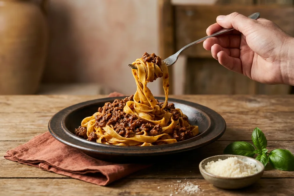
Selección del chef
Cuatro recetas para entender quiénes somos. La carta completa te espera.
ensaladas
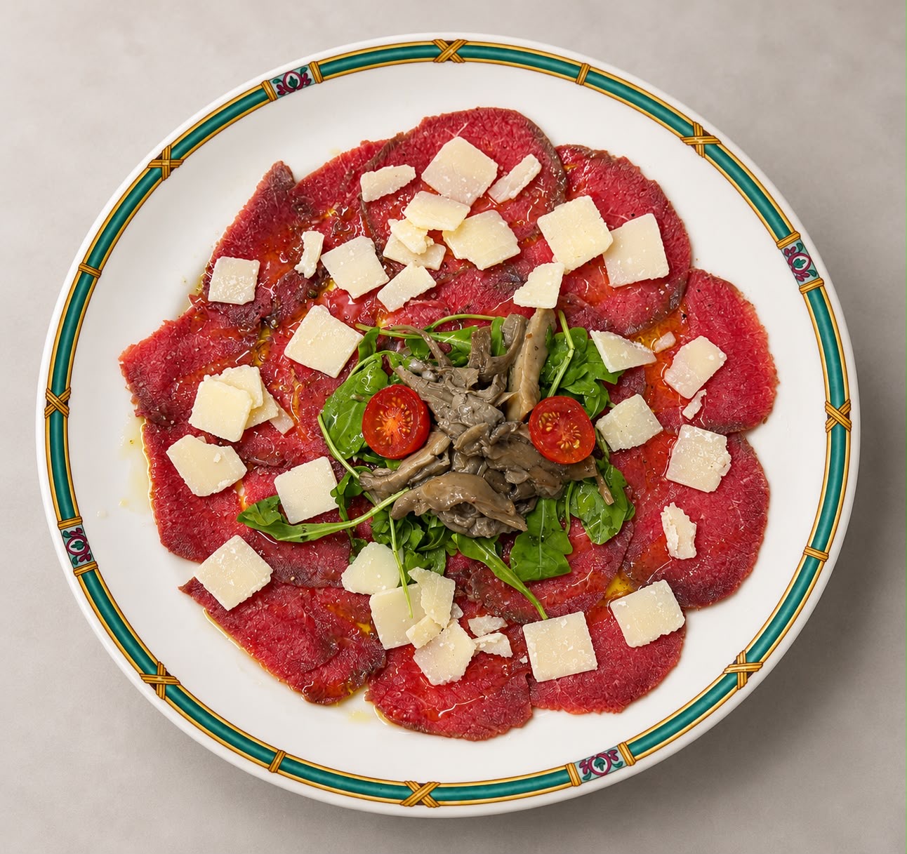 carpaccios
Ternera laminada con salsa Harry's Bar (mostaza, limón y nata)
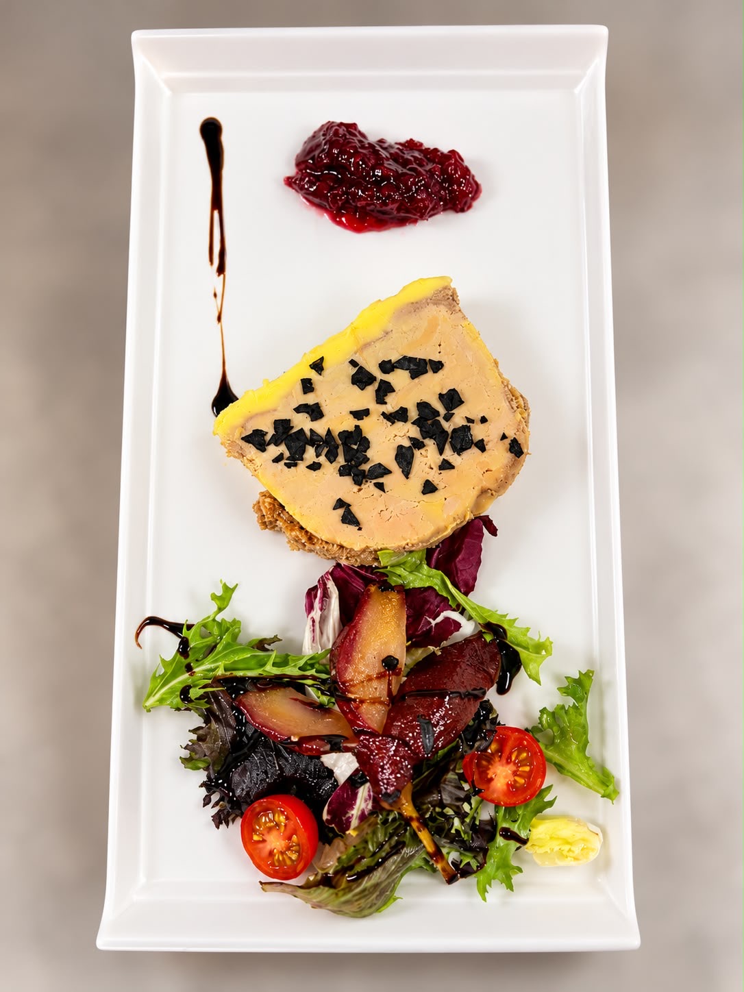 pates-revueltos
Foie de pato y pera confitada en PX
 risottos
Caldo de marisco y langostinos glaseados
Guía San Marco
Cuatro décadas junto a la Plaza de España nos han enseñado qué pregunta la gente antes de venir. Aquí están las respuestas, agrupadas en cinco secciones.
Plaza de España, Catedral y Giralda, Real Alcázar, Triana, Setas, Parque María Luisa y barrio de Santa Cruz: la misma cocina, vista desde cada punto del centro.
Restaurante italiano cerca de la Plaza de España →Cena romántica, cumpleaños, comida de empresa, mesa con niños o terraza al aire libre: te contamos cómo lo montamos en cada caso.
Restaurante italiano con terraza en Sevilla →Pasta fresca del día, pizza de masa madre con 48 horas de fermentación, tiramisú casero, risotto, lasaña, carpaccio y vino italiano.
Pasta fresca en Sevilla, elaborada cada mañana →Reserva online con referencia, menús para grupos, eventos privados, menú degustación, carta de alérgenos y catering.
Reservar un restaurante italiano junto a la Plaza de España →Guías para decidir antes de salir: dónde comer cerca de la Plaza de España, antes o después de la visita, qué pedir y cómo distinguir la pasta fresca de la industrial.
Dónde comer cerca de la Plaza de España →Cuatro salones reservables en el centro de Sevilla, junto a la Plaza de España: de 24 a 110 comensales por salón y hasta 200 en el restaurante.
Restaurante con salón privado en Sevilla →Boda, banquete o comida al mediodía con el salón reservado solo para vosotros: de 24 a 110 invitados por salón y hasta 200 en el restaurante, junto a la Plaza de España.
Restaurante para bodas en Sevilla →Comuniones, bautizos y comidas de familia en salones privados junto a la Plaza de España: de 24 a 110 comensales por salón y hasta 200 en el restaurante.
Celebraciones familiares en un restaurante de Sevilla →Comida al mediodía, comida de Navidad de empresa, comida de trabajo y grupos grandes, en salones privados junto a la Plaza de España, con menú cerrado y factura.
Comidas y cenas de empresa en Sevilla →Llevamos la cocina italiana fuera del local: eventos, empresas, celebraciones y el menú que se sirve, con platos elegidos por cómo aguantan el traslado.
Catering para eventos en Sevilla →Turistas, cruceristas, grupos turísticos y escapadas: un restaurante italiano real en el centro, a dos minutos de la Plaza de España, con la misma carta y los mismos precios.
Restaurante para turistas en Sevilla →Our 33 pages in English for international visitors: where to eat near the Plaza de España, the Cathedral, Triana and Santa Cruz, plus our fresh-pasta, sourdough-pizza and group-dining guides.
Preguntas frecuentes
Estamos en la calle Dr. Pedro de Castro, 1 (41004 Sevilla), a un paseo corto de la Plaza de España y del centro histórico.
Para hacerte una idea de dónde estamos: la Plaza de España queda a un paseo corto y el resto de puntos del centro histórico, como la Catedral, el Real Alcázar o el barrio de Santa Cruz, se alcanzan andando en cómodos paseos urbanos. No hace falta coche para moverse por esta zona. Si vienes en coche, el parking público está a unos 50 metros y la parada de autobús, justo en la puerta.
Esta es una zona muy cómoda para comer: estás junto a Plaza de España y a un paso del centro, así que puedes combinar la visita con la comida sin perder tiempo en desplazamientos. En lugar de caer en el primer menú turístico que encuentres, merece la pena reservar en un sitio con cocina propia, como este, donde el producto y la elaboración se notan en el plato.
Como referencia de precios, la Carbonara romana cuesta 14,00 €; la Lasagna della casa cuesta 16,00 €; el Tiramisú della nonna cuesta 7,00 €; la Burrata pugliese cuesta 17,00 €. La carta se mueve en un rango medio (€€) y la lista completa con todos los platos y precios está siempre en nuestra página de carta. Mantenemos los precios sincronizados con una única fuente, así que lo que lees es lo que pagas.
Si prefieres hablar con nosotros, llámanos al +34 954 41 87 60. Si lo tuyo es escribir, el correo de reservas es reservas@restaurantesevillasanmarco.com. Reservar online te da confirmación inmediata con una referencia que sirve de justificante del día, la hora y el número de comensales; si necesitas cambiar algo, con esa referencia localizamos tu mesa en segundos. Abrimos cada día de 13:30 a 16:00 y de 20:00 a 23:00, junto a la Plaza de España.
Cocina italiana de elaboración propia: pasta fresca hecha cada mañana, pizzas de masa madre con 48 horas de fermentación, antipasti, carnes y pescados, y postres caseros.
En San Marco cocinamos italiano como se cocina en casa: pasta fresca del día, masa madre con 48 horas de fermentación y recetas de familia que no hemos cambiado. Estamos junto a la Plaza de España desde 1994, con dos turnos diarios y opciones para casi cualquier gusto o necesidad.
Si prefieres hablar con nosotros, llámanos al +34 954 41 87 60. Si lo tuyo es escribir, el correo de reservas es reservas@restaurantesevillasanmarco.com. Reservar online te da confirmación inmediata con una referencia que sirve de justificante del día, la hora y el número de comensales; si necesitas cambiar algo, con esa referencia localizamos tu mesa en segundos. Abrimos cada día de 13:30 a 16:00 y de 20:00 a 23:00, junto a la Plaza de España.
Nos encontrarás en Calle Dr. Pedro de Castro, 1, 41004 Sevilla, a un paso de la Plaza de España y del casco histórico. La parada de autobús está justo en la puerta y hay un parking público a unos 50 metros, así que puedes venir en coche o en transporte público sin complicarte. Si vienes caminando desde el centro, la referencia es sencilla: en cuanto llegas a la Plaza de España, estamos a un paseo corto en dirección a la calle Dr. Pedro de Castro.
En temporada alta, fines de semana y puentes sí lo recomendamos. Puedes reservar online en un minuto y recibir confirmación inmediata con referencia.
Recomendamos reservar, sobre todo en temporada alta: fines de semana, puentes y la primavera sevillana llenan la sala. Reservando eliges día, hora y número de personas, y recibes una confirmación con referencia que puedes cambiar o cancelar sin coste hasta 24 horas antes. Si vienes sin reserva, te diremos con sinceridad si hay mesa o cuánto hay que esperar.
Como referencia de precios, la Carbonara romana cuesta 14,00 €; la Lasagna della casa cuesta 16,00 €; el Tiramisú della nonna cuesta 7,00 €; la Burrata pugliese cuesta 17,00 €. La carta se mueve en un rango medio (€€) y la lista completa con todos los platos y precios está siempre en nuestra página de carta. Mantenemos los precios sincronizados con una única fuente, así que lo que lees es lo que pagas.
Si prefieres hablar con nosotros, llámanos al +34 954 41 87 60. Si lo tuyo es escribir, el correo de reservas es reservas@restaurantesevillasanmarco.com. Reservar online te da confirmación inmediata con una referencia que sirve de justificante del día, la hora y el número de comensales; si necesitas cambiar algo, con esa referencia localizamos tu mesa en segundos. Abrimos cada día de 13:30 a 16:00 y de 20:00 a 23:00, junto a la Plaza de España.
Sí. Tenemos opciones sin gluten, vegetarianas y veganas en varias secciones de la carta, y adaptamos platos si nos avisas al reservar.
Contamos con platos sin gluten, vegetarianos y veganos en la carta, y también adaptamos recetas cuando nos avisas. Lo mejor es decírnoslo al reservar: así la cocina prepara tu plato con protocolo separado y puede proponerte alternativas dentro de lo que te apetece. Si tienes una alergia concreta, indícala y la revisamos plato por plato contigo.
Como referencia de precios, la Carbonara romana cuesta 14,00 €; la Lasagna della casa cuesta 16,00 €; el Tiramisú della nonna cuesta 7,00 €; la Burrata pugliese cuesta 17,00 €. La carta se mueve en un rango medio (€€) y la lista completa con todos los platos y precios está siempre en nuestra página de carta. Mantenemos los precios sincronizados con una única fuente, así que lo que lees es lo que pagas.
Si prefieres hablar con nosotros, llámanos al +34 954 41 87 60. Si lo tuyo es escribir, el correo de reservas es reservas@restaurantesevillasanmarco.com. Reservar online te da confirmación inmediata con una referencia que sirve de justificante del día, la hora y el número de comensales; si necesitas cambiar algo, con esa referencia localizamos tu mesa en segundos. Abrimos cada día de 13:30 a 16:00 y de 20:00 a 23:00, junto a la Plaza de España.
Abrimos todos los días con comidas de 13:30 a 16:00 y cenas de 20:00 a 23:00. Aceptamos grupos, celebraciones y comidas en familia, incluso con menús cerrados.
Nuestro horario es el mismo todos los días: comidas de 13:30 a 16:00 y cenas de 20:00 a 23:00. Al tener dos turnos puedes elegir el momento que mejor te encaje, ya sea un almuerzo temprano antes de seguir la visita o una cena tranquila. La cocina trabaja a partir de esos horarios, por eso te pedimos puntualidad en la hora reservada.
Somos un buen sitio para comer en grupo: preparamos menús cerrados, mesas amplias y salón privado para celebraciones. Con solo saber cuántos sois y el motivo, te proponemos la fórmula adecuada y ajustamos alergias o dietas. Trabajamos cumpleaños, comidas de empresa, comuniones y reuniones de familia con la misma atención que una mesa de dos personas.
Como referencia de precios, la Carbonara romana cuesta 14,00 €; la Lasagna della casa cuesta 16,00 €; el Tiramisú della nonna cuesta 7,00 €; la Burrata pugliese cuesta 17,00 €. La carta se mueve en un rango medio (€€) y la lista completa con todos los platos y precios está siempre en nuestra página de carta. Mantenemos los precios sincronizados con una única fuente, así que lo que lees es lo que pagas.
Si prefieres hablar con nosotros, llámanos al +34 954 41 87 60. Si lo tuyo es escribir, el correo de reservas es reservas@restaurantesevillasanmarco.com. Reservar online te da confirmación inmediata con una referencia que sirve de justificante del día, la hora y el número de comensales; si necesitas cambiar algo, con esa referencia localizamos tu mesa en segundos. Abrimos cada día de 13:30 a 16:00 y de 20:00 a 23:00, junto a la Plaza de España.
Cómo llegar
Calle Dr. Pedro de Castro, 1 — 41004 Sevilla. La parada de autobús está justo en la puerta, hay parking público a 50 metros y la entrada principal de Plaza de España queda a un paseo.
Horario
Lunes a domingo
Comida · 13:30 – 16:00
Cena · 20:00 – 23:00
Reserva
Confirmación inmediata · Cancelación gratuita hasta 24h antes · Mesa en sala, terraza o salón privado.
Reservar ahora